Welcome to our Showcase of Clean Minimalist Logos. A logo has to work incredibly hard. It has to advertise a company, give an idea of what the company does, introduce the company’s personality and stand out amongst the millions of other logos that compete for any one person’s attention. Many companies are finding that, in a crowded and noisy market, a clean, minimalist logo stands out better than anything else. Below is a showcase of ten such logos.
Kode Nu
Kode Nu is an app design studio in Los Angeles. This logo reflects the company’s coolness and focus on technology with the pixel-like boxes of colour, shaped to suggest the letter ‘K’.
Chatbox.fi
Chatbox is a Finnish company that provides a web-based customer service app. This logo combines a speech bubble with a 3D box effect, combining the two elements of the company’s name.
CognitiveBits
CognitiveBits is a design and development company that specialises in iPhone and iPad apps. The brand mark is beautifully simple, minimalist and clean and is a great representation of bits coming together.
Sixtudio
Spanish web design and development studio Sixtudio has a logo that features the main colours of printing: cyan, magenta, yellow and black. These colours on a white background create impact whilst remaining simple and direct.

Typophotography
Typophotography is an art project that lays a writer’s words over a photographer’s image to create a new work. The logo of the project combines tools of the two art forms into one clean icon.
Ça C’est Gang
Ça C’est Gang is a French creative collective which sells t-shirts, amongst many other things. Their logo, called Mr Poke, reflects the urban, artistic background of the members of the collective. The logo is minimal because, although it is very detailed, all unnecessary elements, like a neck and eyes, are deleted.
Maak Media
Maak Media is a German web design company. Its logo doesn’t include any drawings or visual puns, but it does have a rounded typeface that makes it stand out.
Shelter
Shelter is a well-known charity that works on housing and helps homeless people get off the streets. The ‘H’ in the logo says it all, really.
Dreamten Studios
Virginia-based design and development studio Dreamten Studios has about as minimal a logo as you can get. The simple design is symmetrical, with few flourishes, but it still reflects the name and aesthetic of the company.
Sharktoast
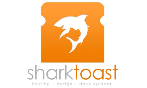
This may be one of the most fun logos of all time. Sharktoast, a web design, hosting and development agency, has a logo that combines the fierceness of a shark and the unexpected whimsy of a piece of toast, giving a really good sense of the work ethic of the company.
Have you found any examples of beautifully clean, minimalist logos that you’d like to share? We’d love to hear about them in the comments.





0 Comments