While there are many different types of logos – from elegant and refined to quirky and surprisingly unexpected – my favourite logos are the ones that have a hidden message. Whether it’s Amazon’s subtle arrow between the A and the Z, both forming a smile and suggesting that they offer everything from A to Z, to FedEx’s hidden arrow between the E and the X – my favourite logos are the ones that carry a clever hidden message. And one of the best ways for a logo to sneak a hidden, playful message in is to make use of the negative space.
Negative Space in Logo Design
While it’s incredibly difficult to actually design a logo that uses the negative space effectively, when it’s done well the results can be astounding. We’ve brought together a collection of creative, interesting and wonderfully clever logos that all make use of the negative space – whether it’s to add a hidden message or to simply add an extra element of style to the design. In either case, we hope you find our roundup interesting and, hopefully, useful for your next logo design project.
Rocket Golf
Source: link
Paint the City
Source: link
HillRoad Service

Source: link
WWF
Source: link
Pittsburg ZOO & PPG Aquarium
Source: link
Jam Session
Source: link
Limit club
Source: link
Fork & Knife
Source: link
Energy Cannon
Source: link
Layne Savoie Golf Logo
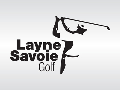
Source: link
Arrow Inc
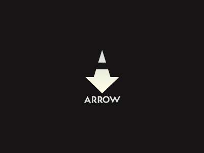
Source: link
Wineforest
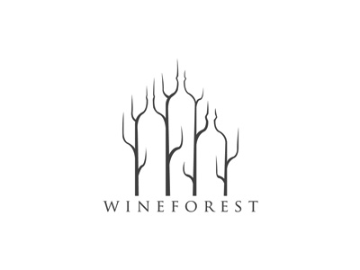
Source: link
Ahmatron Logo
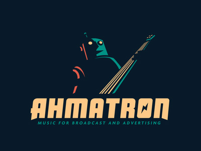
Source: link
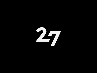
247
Source: link
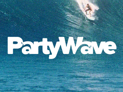
Party Wave
Source: link
Have you found any examples of beautifully styled, clever and imaginative logos that make a good use of negative space? Let us know in the comments.


0 Comments