
One web designing trend that has been steamrolling its way past the other “more eye-catchy” trends is minimalism. The subtlety seems to be replacing alleged cheesiness. Flat designs have surprisingly become far too popular than what we could envisage a few years back. However, this popularity is gradually pushing the flat designs to become too common these days.
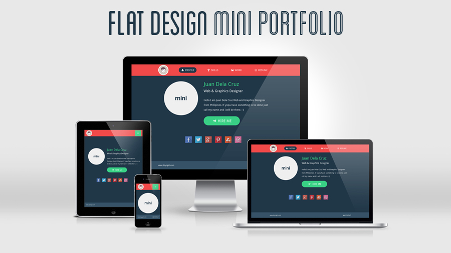
Considering the fact that the minimal web designs are being liked by a large chunk of Internet users, more and more brands are leaning towards this type of website designing to make the most out of this trend. While that is an indication of their catchy visual appeal, but this has also led to web creations that are too flat for the liking. Web designers of the world are tending to make the growing traction towards minimalism an excuse to compromise the creativity and effort making, the result of which is pretty lackluster designs that are fading into oblivion pretty fast.
When does Minimal Become Lackluster?
When a designer focuses too much on responsiveness, cross-compatibility and the supposed affinity for minimalism, that’s when the final design climaxes into mundanity.
This is an age of sleek technology where everything has become too glossy and slick. So, when we as Internet users keep stumbling into flatly designed websites, the supposed attraction towards them turns tedious. The trend remains trendy as long it is being supplied in short bursts. When you see just about the same thing all around you, the wow factor wears out and you look for something that’s rarer.
Flat Forces Professionals to Compromise on Features
On the surface, there is no likely corelation between the minimal design and feature specifications, but be rest assured, they influence each other in quite a big way – at least, in the eyes of the ened user. When your mobile application users observe too simple an application design, they tend to take it for granted that the app won’t be exactly boiled with features.
When it comes to websites, there are multi-faceted brands that sell products which ned to be promoted with a certain degree of vigor and vibrancy. A website of a brand that is into creating powerful video games of the likes of car races, zombies, superheroes etc. has to have extravagant websites for attracting their target audience. A visually appealing minimal website will only appear dull to the game freaks who would like to be overwhelmed by the effects, colors and the overall interface of the platform that advertises all the video games they are wiling to download or invest it.
Blending Multiple Colors Becomes a Task too Unwieldy
Again, there are products that need more than 2-3 colors to represent them online. A website with subtle and gray tones won’t suit a website that is around women’s fashion. In such a case, mixing multiple colors and still retaining minimalism becomes impractical and the final results only looks like a ragbag version of what originally should been fanciful and instantly catchy. Getting the right combination of colors is critical, and when you are constrained by the instructions to be flat, that’s when your designing endeavor begins to go kaput.
Experimenting with Typography is Constrained
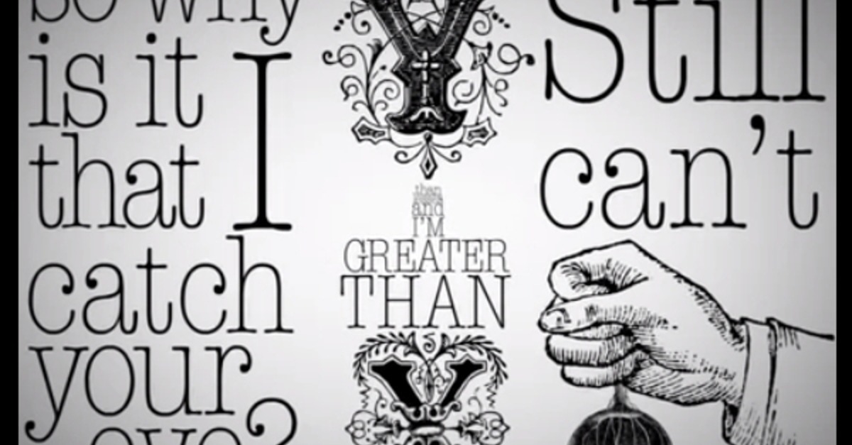
There is no dearth of minimally designed websites that cleverly use typography to lend their website an instant appeal. But the maximum distance they go is by varying the fonts they are using. At times, we see use of 2 fonts in a single word and with certain brands, we see each letter being written in different fonts. However, when it comes to adding colors to fonts and still keeping things flat, this combination is hardly done right. Typography Is certainly the scripting success of various website designs, but when you are already putting a tab on yourself in terms of the patterns and textures you wish to use on fonts, you loose the freedom of experimentation, which goes on to dispirit your creative instincts
Now, not being too minimalism doesn’t imply that you make your website choke on its own excesses, but it’s all right to go ahead and make it a little more playful and let it have some extravagance to flaunt.


0 Comments