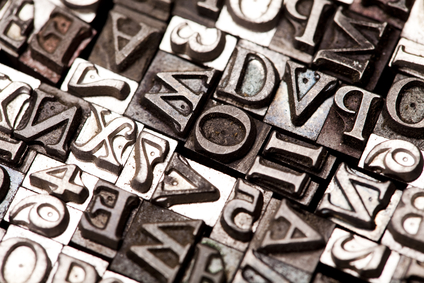
Typography is a vital and indispensable part of design. Good typography can elevate a brand, idea or logo design to a work of art; bad typography can just as easily sink it. In “The Elements of Typographic Style,” Robert Bringhurst likens bad typography to “starving horses in a field.” If typography works in print design, it should work just the same on a Web page, right? Nope—and there’s a good reason why print and Web design have different rules and different fonts.

A Typography Overview
Collins English Dictionary defines typography as “the art, craft or process of composing type and printing from it.” This definition works but it’s a bit rigid, especially in an age where typography has long since transcended the confines of print media. Typography is widely considered to be the art of arranging type into a design-appropriate layout that is not only legible but aesthetically pleasing.
Typography is especially important in terms of Web design, as it has a heavy influence on the way that a website conveys information to viewers. Large headers, bold blocks and small, highly legible but aesthetically pleasing text are all tools used to help draw attention, capture interest and deliver critical information.
Typography is used to convey a broad range of emotions, to attract attention and to create a picture-perfect image of a product, service or the company itself. From the professional and highly legible to the whimsical and free-spirited, typefaces have the power to impact and persuade viewers simply based on their design aesthetic. If it weren’t for typography and the amazing array of typefaces it has inspired over the centuries, the world would be a more boring place.
Different Mediums, Different Rules
At first glance, there might not seem to be much difference between typography in terms of print and Web design. When dealing with either medium, designers have to consider the audience and demographic they are trying to reach. For instance, a high-quality postcard printing service will be concerned with using the right paper stock in addition to relying on colors and fonts to create an effective and desirable product. Likewise, color, composition and a variety of other elements play a critical role in attracting end-users.
However, the differences between print and the Web quickly make themselves known once a designer starts dealing with the latter in earnest. Computer monitor sizes, monitor colors, contrast settings and the ability of users to adjust default font sizes, window sizes and font choices are all factors that separate the Web canvas from its print counterpart. Web designers were restricted to a small set of universal fonts (Verdana, Georgia, etc.) until the introduction of Typekit and other embedded font hosting services back in 2009.
There are more than just technical restrictions that separate Web typography from its print counterpart. Given that Web pages are specifically intended to convey readable information, the designer’s approach to typography becomes much different. There are a number of strategies essential to successful typography on the Web, including the careful use of macro- and micro-typography. Macro-typography focuses on the overall text structure of the document, including the location of the navigation and number of columns to be used. Micro-typography focuses on the smaller details, including the primary font-face and size, link color, spacing and headline sizes.


0 Comments