The new year heralds new trends for color and Web design. In 2013, designers concentrated on clean designs that included interactive elements and bold, alternating hues. Light pastels and neutral tones created friendly and inviting sites, whereas bright neons were used to create a contemporary feel. Whether you’re remodeling your e-commerce website, starting a design career and looking for graphic design degree program resources or starting a blog, begin the new year with a cutting-edge, impeccably designed site. Here’s what we can expect to make a visual statement in 2014:
Color Showcase
Pantone LLC of X-Rite, Inc., is the leading color authority that provides color systems, technologies and professional color standards across various industries, including the graphic arts. Pantone specializes in multimedia graphics and offers systems and guides on selecting and matching ink colors for printing and publishing.
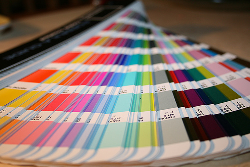
Photo by jepoirrier via Flickr
Designers collecting color ideas for a 2014 cosmetic redesign can use Pantone’s Fashion Color Report as a guide. Top colors for 2014 include pastels such as placid blue for tranquility and toasted sand for carefree neutrality. Cayenne is an exciting red, and Paloma, a sophisticated gray, can adapt to any bold color scheme. For an optimistic and spontaneous vibe, go for celosia orange. For warmth and powerful energy, paint your site yellow with freesia.
The use of bold color isn’t anything new, but for 2014, bold hues will be more harmonious and modulated, according to Nancy Kimberlin, graphic design freelancer and founder of Exclusive Branding and Identity. Pastels will go shaded or floral, depending on the maturity or playfulness of the site.
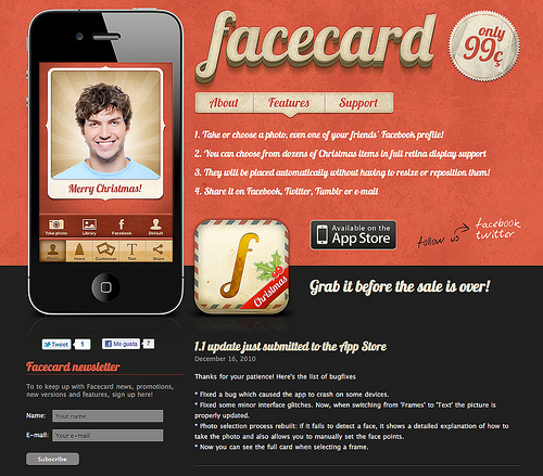
Photo by Arturo Martin via Flickr
The Pantone View Colour Planner emphasizes bright colors, diverse pastels and grays for the skeletal framework. Blues will beautify and energize a digital space, while reflective metallics draw attention. Use black as a background and complex pink hues for emotional appeal.
Palette Predictions
As Web creatives soak in 2014 Pantone color spotlights, industry leaders have also made predictions on the color of the year. As the industry ditches emerald green as 2013’s color the year, iStock offers the following predictions in its Pantone Predictions Color of the Year 2014 infographic:
Tomato red brings more life and heats up advertising and art (Alexandre Ravagnani, Executive Creative Director at F.biz)
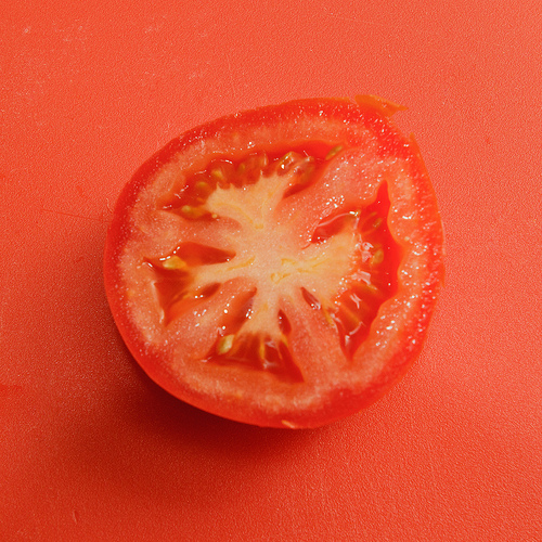
Photo by Will Hastings via Flickr
Deep blue protects an entity’s authenticity and purity (Michele Mariani, Executive Director, Armando Testa)

Photo by Jakerome via Flickr
Charcoal gray represents timelessness and classic trendiness (Sheena Lidgett, Art Director, Getty Images)
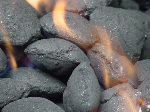
Photo by Lynda Giddens via Flickr
Dazzling blue invites audiences to dive right in to its strong character and intensity (Simon Erdmann, Jr. Art Direct, serviceplan one)
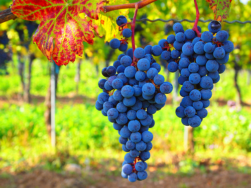
Photo by Roberto Verzo via Flickr
Earthy gray enhances visual communication, and its pebble-like aesthetic softness provides photographic aspiration (Rebecca Swift, Head of Creative Planning, iStock)

Photo by jigpu via Flickr
Design Trends
Along with a moving color scheme, simplicity and flat design reign for the user experience and digital relevancy. The flat look is considered a modern and sleek style for 2014. Don’t fear those white, unfilled spaces. A visually clutter-free digital space will place more emphasis on the content. Single- and long-page websites improve information processing, and a minimalist interface with creative typography are changing the cornerstones of Web design.
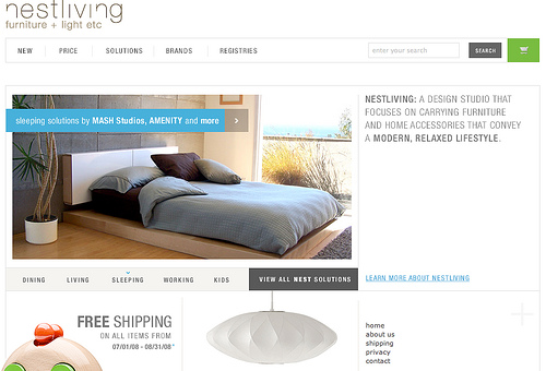
Photo by Urban Jacksonville via Flickr





0 Comments