We all are well aware about ‘Home’, ‘Contact’, and ‘About’ pages, and developers are focused generally on these pages. This is good approach, but never ignore the error page design. Due to any kind of error such as server, page has removed from website, technical or connection, visitor can reach at the 404 error pages.
This is uncertain and sometimes can lead visitors to stay away from the sites. Thus, you need to focus on designing a creative error page, which is capable to hold, engage and desperate customers to locate the right path and browse again.
We can say that 404 error page is a hidden world of every website, which comes rarely in light. So, build a stunning 404 error page to impress customers and catch their interest towards your site. Here, I have a collection of 10 websites that comprise outstanding error page designs for your inspiration. If you want to share your experience and thoughts, feel free to leave comment through comment box.
Daniel Karcher Film Design Studios
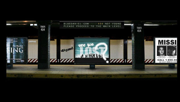
The excellent use of animations, including sound effect, makes this page an outstanding 404 error page. It employs a beautifully rendered subway station with an empty train, which rolls in. Overall, it is a perfect example and the whole page design diverges the great effect. Check it out yourself and build such types of web pages to add in your site with the implementation of new ideas.
Appschopper
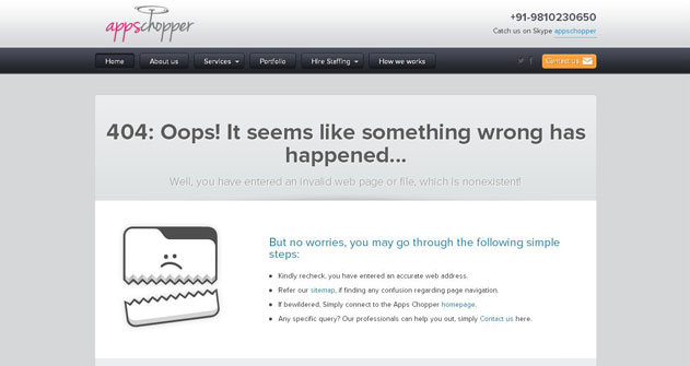
The 404 page design of appschopper has a cute little tableau, which conveys right message to check the error. This page cannot wrong in our eyes, but encourages to cross check whether or not you have any technical issue. The images are cleverly used here that don’t need lots of technical sounding texts across the error page.
Hakim El Hattab
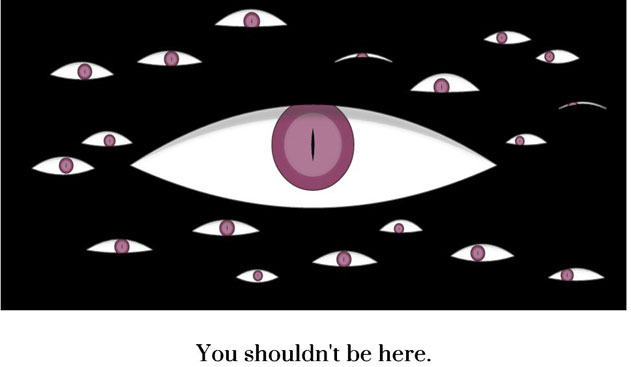
The experiment of HTML5 features with some creepy eyes, which is used at the error page of Hakim El Hattab website. The movement of eyes follows your cursor around the page with occasional narrowing as well as blinking. The brilliant execution of an interactive image on this page with animation.
Audiko
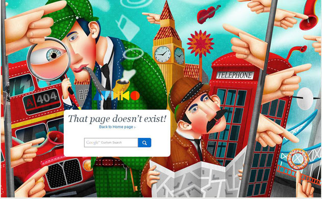
Audiko is a free ringtone-making services provider website and the 404 page design of this website covers a beautiful illustration of London, including telephone box, Sherlock Holmes, obligatory red bus, Big Ben’s Tower and a hint of Tower Bridge. According to me, the main focus of designer is on artwork to attract visitors, while creating Audio’s 404 page.
ApartmentHomeLiving
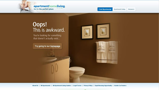
The designer of ApartmentHomeLiving’s 404 web page has implemented unique idea with a strange interior shot. You can see a fade sheep, which is randomly appear on the lavatory, while you put cursor on lavatory. Amazing and wacky design with perfect management makes this page outstanding.
Blue Fountain Media
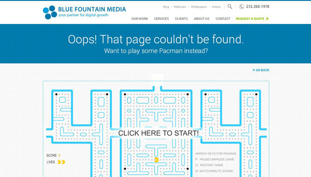
In case, you got bored, when you are unable to find out the page, which you are looking for, “Blue Fountain Media” has incorporated a funny Pac-man game at 404 page for your enjoyment and stay connect. This is a good approach to engage their valuable visitors.
Modcloth
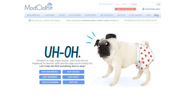
404 page of Modcloth website is not only cute, yet it has a strong call to action and desperate to search the best collection of clothes. This page can direct you all those pages related to cloths’ search that you’re looking for on this amazing site.
PSDtoWordPressExpert

After seeing this 404 page, I am not sure of what it says. I can only assume, it says click here to reach in PSDtoWordPressExpert, but once you click anywhere on the illustration, it will redirect to the home page.
Nosh
Many people have doubted that Nosh’s 404 page should count in the most creative error pages or not. There is a funny video, which has been posted at this website. The guys did their great job in creating a successful fun video. Do you think that it is the best one, check it out.
CSSChopper
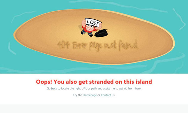
CSSChopper’s 404 page design is very simple yet interesting to convey message that locates the right path/URL or go to the home page to complete your search. This page gives inspiration to build a professional error page without any navigation, animation or multimedia effect.
Conclusion:
404 pages don’t be blank pages controlled by different browsers. You can take complete control on your own. Just decide to use an extravagant approach with a solid representation.
Have you worked ever on error pages design? If yes, then share your thoughts or let us know via comments.


Great post it is..!!!