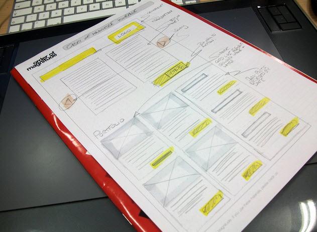
Designing your website or your blog to get as many conversion as possible is an major part of having a successful blog. It doesn’t matter what the goals are of the blog, if you can’t convert people, then your goals will never be reached. A lot of blogs try and get people to sign up for alerts or weekly updates, but then there are other blogs who rely on their audience to bring in an income. Either way, getting people to interact with the important aspects of your site is a must, to let’s take a look at a few things you can do to help your conversion rates.
Design Your Blog to Maximize Conversions

Place Your Call to Actions Correctly
Using plenty of call to actions throughout your site will help to convince people to click and convert over. The only problem a lot of bloggers have is that they don’t place those call to actions in the right places. You need to have them in an easily accessible place that is very visible. Having them at the bottom of your page or next to the advertisements usually won’t bring many people in because they tend to stay away from advertisements and might not venture to the bottom of the page. Instead, trying placing them at the top of your home page, in the middle of your content and other highly trafficked areas.
You should also make sure that the call to actions are big and identifiable. A common way to use them is to put a big button that says “subscribe now” or “buy now” that is a different color to help people pay attention to it. The more you are able to attract people to those call to actions, the more effective they will be.
Use Contrast Effects to Your Advantage
There is a huge definition to what Contest Effects really is, but simply put, use bright, bold, and other effects to draw attention to important areas of your site. If you want people to pay attention to the benefits a product , then you could use different effects on that section so that it can easily be focused on. Professional designers use this techniques in multiple different ways to create an illusion of importance and forces the viewers to take notice of that particular area. There are plenty of different ways you can implement this technique, and it can be hard to figure out the best ways at first. Once you have done it a few time and study the results, you will soon learn what works and what doesn’t.
Take Advantage of White Space
If you notice an area in your site where you haven’t placed anything and it’s a big wide open area, then use that to help convert your readership. You can use white space to your advantage by placing call to action buttons, promotional information, advertisements, and anything else you want. You just need to make sure you don’t crowd the area. By only placing 1 or 2 things in a large white space area, it will make them stand out more and give your readership a better chance at interacting with them. If there is 6 or 7 different things all crowded together, it looks bad and also doesn’t really let the readers focus on a particular thing.
If you implement these three tips into your blog, you will start to see much higher conversion rates and have an overall better blogging experience. There are plenty of other different strategies that you may be able to implement, depending on your niche, but these tips can be used for any blog that you have.


0 Comments