There are a nearly endless number of design decisions that you must make when creating a logo. For a piece of art that has such a small canvas size, every decision you make is magnified. If you opt for a modern, flat design style, that informs the personality, tone and visual appearance much more than you might at first think. Similarly, if you choose the other end of the spectrum and go for a vintage, retro-style affair, it can have a huge impact on how the logo design is perceived. Typically, vintage style logos add a splash of personality to a design, and because it’s relatively unexpected to see such a nostalgic design on a modern medium like the screen, it can also add a level of quirkiness and interest.
Personally, I’m a huge fan of logos that use a vintage effect – whether that’s in the form of muted colours, badge shapes, ribbons and grungy textures. They’re very difficult to get right – like most logo designs – but when they’ve been carefully crafted and agonised over, you can tell.
I’ve collected some of my favourite examples – some are brand new, while others have been around for a while – but each of these designs is a great example of what you can achieve if you put a lot of thought, care and effort into a design style.
Barrel Roll Creative Logo
The Finest Quality In The Uk

Kingsway
Foster Willis Magicians Fantasy Vintage Logo
Thunder Mountain Coffee

Music Store Live Logo
Vintage Badge Design
Source
EKU Art Design Dept

Vintage Records
Source
Kanue Foster
Rorc Logo Options
Source
Alvin’s Seafood Palace Vintage Fantasy
Seaharvest

One On One Flavours
Seward Adventure Company

Source
T-Shirt Concept
Vintage Salsa Logo
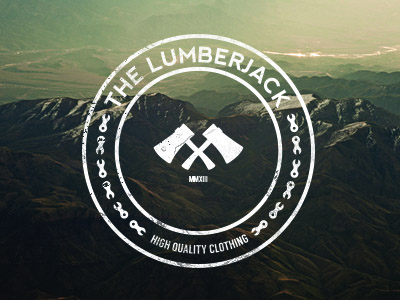
The Lumberjack
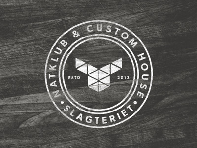
Slagteriet 2 WIP
Source
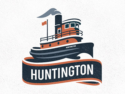
Huntington
Have you come across any beautiful, creative and imaginative logo designs that use a vintage style? We’d love to hear what you’ve found in the comments!





0 Comments