Color palettes are collections of colors that work well together and create a harmonious visual effect. They are essential for any design and art project, as they help to convey the mood, message, and style of your work. But how do you choose the right color palette for your project? And where can you find inspiration for new and exciting color combinations?
In this article, we will explore some of the best sources and tools for finding and creating color palettes, as well as some tips and tricks for using them effectively.
Sources of inspiration for color palettes
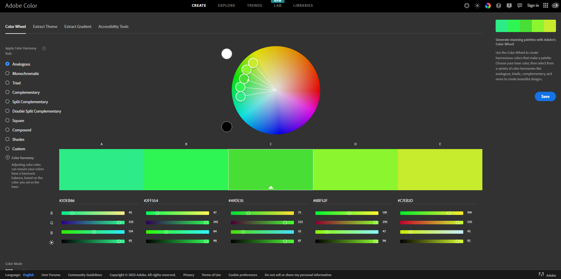
One of the easiest ways to find color palettes is to look at the world around you. Nature, art, fashion, architecture, and culture are full of beautiful and diverse colors that you can use as a starting point for your own palette. For example, you can take a photo of a sunset, a flower, a painting, or a cityscape and use a tool like Image Picker or Adobe Color to extract the main colors from it.

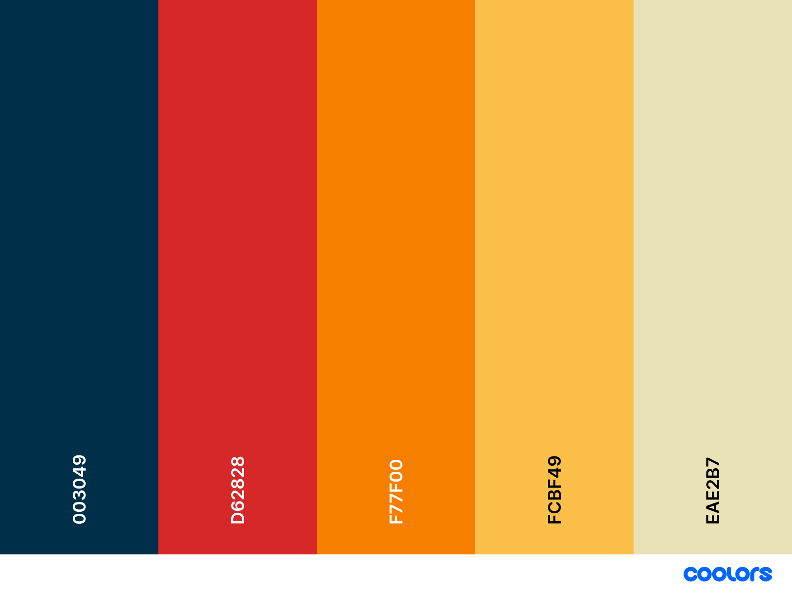
Another way to find color palettes is to browse online platforms that showcase thousands of color schemes created by other designers and artists. Some of the most popular ones are Color Hunt, Coolors, and Canva Colors. These platforms allow you to search by keywords, categories, popularity, or random selection. You can also create your own palettes by using their generators or editors, and save them to your account or export them to various formats.

Tips and tricks for using color palettes
Once you have found or created a color palette that you like, you need to know how to use it effectively in your project. Here are some tips and tricks that can help you:
- Use a limited number of colors. A good rule of thumb is to use no more than five colors in your palette, as too many colors can make your design look cluttered and confusing. You can also use different shades or tints of the same color to create contrast or harmony.
- Use a dominant color. A dominant color is the one that stands out the most in your palette and draws attention to your design. It should be used sparingly and strategically, such as for headlines, buttons, or accents. The dominant color should also match the tone and mood of your project.
- Use complementary colors. Complementary colors are those that are opposite each other on the color wheel, such as red and green, or blue and orange. They create a strong contrast and make each other pop. You can use complementary colors to highlight important elements or create balance in your design.
- Use analogous colors. Analogous colors are those that are next to each other on the color wheel, such as yellow and green, or purple and blue. They create a harmonious and soothing effect. You can use analogous colors to create a calm or relaxing atmosphere in your design.
- Use triadic colors. Triadic colors are those that are evenly spaced on the color wheel, such as red, yellow, and blue, or green, orange, and purple. They create a vibrant and dynamic effect. You can use triadic colors to create a lively or energetic atmosphere in your design.
Patone colors
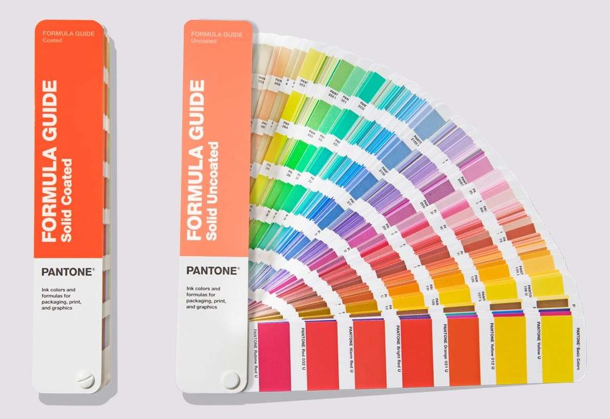
Pantone is a renowned authority on color and provider of color systems and leading technology for the selection and accurate communication of color. Pantone has developed a system of identifying and matching colors, using standardized codes and names, that can be used across different media and applications.

Pantone also publishes trend reports and forecasts, as well as selecting a Color of the Year every year since 2000. Pantone colors are widely used by designers, brands, and manufacturers to ensure color consistency and accuracy in their products and communications.
Conclusion
Color palettes are an important aspect of any design and art project, as they help to communicate your vision and style. You can find inspiration for color palettes from various sources, such as nature, art, fashion, architecture, and culture. You can also use online tools like Color Hunt, Coolors, and Canva Colors to browse or create thousands of color schemes. When using color palettes in your project, remember to use a limited number of colors, choose a dominant color, and use complementary, analogous, or triadic colors to create contrast or harmony.
For professionals across a range of industries, Pantone is an invaluable tool. Its precise color matching system is crucial for print studios, ensuring that the colors in the final printed product match the original design intent. In addition, Pantone’s digital tools like Pantone Connect make it easier for teams to collaborate. It ensures everyone in a workflow is using the same color sample, which is crucial in professional settings.
We hope this article has given you some useful information and ideas for finding and creating color palettes for your next project. Happy coloring!
Related:
ColorPalettes.net: Color Palette Ideas
Picular – The color of anything
Huemint – AI color palette generator
Colormind – the AI powered color palette generator
19 Color Palette Generators That Make Web Design Easier
The Psychology of Color on Website Design – Infographic


0 Comments