In recent years, we’ve seen dozens of trends, from pastels to gradients to big typography. Styles have a way of circling around and coming back into fashion. One thing that never goes out of style, though, is bold and strong design elements that grab user attention and make a strong statement.
According to the U.S. Small Business Administration (SBA), there are 31.7 million small businesses, although the number changes frequently. Many of those businesses have websites or social media pages. If you want to stand out from your competitors and the thousands of other companies in any sector, you must take some adventurous steps.
When defining “bold,” it can mean colors, type, features or even language choices. Here are seven ways to embrace the core concepts of bold web design for your own company:
1. Include Vivid Colors
One way of creating a bold design is going with vivacious hues you wouldn’t normally see. If you run a bank, and every other bank in your town uses blues and deep reds, opt for orange, pink or something outside the norm. Sometimes, going with the unexpected helps you stand out and remain at the forefront of users’ minds.

Cyclemon’s website uses bright colors to lead the user to click for more information. The array of hues goes from pink to sky blue to sunny yellow. The parallax effect adds to the color variations and bright, cheerful notes of the design.
2. Brand Your Style
You likely already have a brand style guide. Think about the message you’d like to send to your customers. Do you want a steady and serious tone? Is your brand fun and hip? Look at the things you’ve already written into your style guide and figure out how to work around those while still keeping a bold design.
For example, if you have a color palette utilizing neutrals, what bold pop of color can you add? If you have the text type already selected, can you make it larger or bolder for headlines or specific words? Work within the guidelines of your style guide for consistency while simultaneously adding a bit of zest to your website.
3. Use Beautiful Images
The photos you choose for your website have a huge impact on site visitors. They say a picture is worth 1,000 words. What are your images saying about your business? Look for dramatic photos that make leads sit up and take notice. Do your pictures tell a story and capture attention immediately?

Colonial Excavating uses a photograph showing the power behind their equipment. The image takes up the entire screen above the fold. When you land on the page, you see the bold picture first. The brand also utilizes large typography to point out that excavation is their specialty. The design signals strength with the contrast between the black background and white letters.
4. Add Animation
Others in your industry may not use some of the more trendy features in web design. You can make a daring statement by being one of the first to do so. Add in some animation to draw user attention and make your site more interactive. Create movement whenever the mouse hovers over an item, so users know where they are in your site’s navigation and what happens if they click on something.
Add some arrows pointing to the call-to-action (CTA) button that you want a lead to click on. Stream video in the background to show what your brand is best known for. Don’t add graphics just to add them. Each item should have a specific purpose, pointing the user through the sales funnel in smart ways.
5. Enhance Typography
Another way of making a bold statement is via the typefaces you use on your site. Look for ways to enlarge the type. Make it bold or fill it in with a pattern. You can even do cutouts where the background shows through the letters. Look at many different examples of beautiful typography and see which style speaks to your personal preferences for your company’s image.

Allbirds keeps their overall design simple and then uses large, bold type for their tagline of “Feel a material difference.” The other type on the page is lower in the font hierarchy, drawing the user’s eye to the larger text.
6. Go for Shocking Language
Know your customer base. If they’re not easily offended, you could potentially use some strong language and draw interest. Even a snarky attitude can attract some customers. However, you have to know who your typical buyer is. If you use bold wording and it offends half your customers, then you’ve lost traction. Tread with caution but try new things to see how your user base responds.
7. Throw Out Symmetry
Asymmetrical designs are in, and they can give your site a look it just doesn’t get from grids. Think about overlapping elements you might utilize, but always consider how the finished product will look on mobile devices. You can also create some layered items, plus others that fall into a more traditional boxed structure.

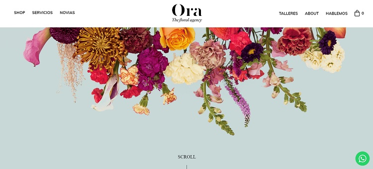
Ora is a floral agency. They utilize layering to place beautiful flowers across the top of their landing page. These flowers trail down into the main part of the background and are closer to the header in other spots. However, as you scroll down the page, the rest of the content is in a familiar grid-like layout. The header choice is bold and grabs the user from the minute they land on the page.
Is Bold Web Design Right for You?
You know your audience better than anyone else. If you feel that daring options work for your typical customer, then you should try some new features. Conduct A/B testing on any changes you apply and see how your users respond. The great thing about web design is that you aren’t stuck with something if it doesn’t convert visitors into leads.


0 Comments