A battle has been raging behind computer screens for almost a decade now. There have been few casualties, but it still has serious repercussions. This battle is between two competing approaches to design – skeuomorphism and flat design – and the victor will influence the look and usability of our digital devices for years to come.
What are skeuomorphism and flat design?
On the simplest level, skeuomorphism and flat design are simply two different ways of representing the functions of a computer, digital device or website. Skeuomorphism seeks to replicate real-world items in its design, and flat design rejects that.
Skeuomorphism is not just a design feature that makes things have a 3D feel. It is the actual decision to base new things on old, whether or not the new things need to be like the old ones. The computer calculator that is laid out like a real-world calculator, web pages that look like paper on a desk and the shutter click that your digital camera uses are all skeuomorphs. Often, designers seek to imitate the way these objects look in the real world as well, shading so it appears that light bounces off the object, layering on textures like wood or leather, and animating the object so it looks like buttons are being pressed or levers pulled, as they would be in the physical world.
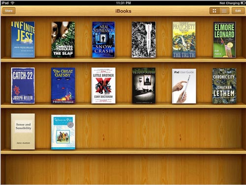
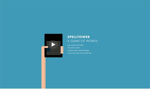
Flat design, by contrast, seeks to get rid of any part of a design that isn’t strictly functional. It is minimalist at its heart, and this is reflected in its look. In flat design, the calendar is just a square of colour with the dates on it. The camera will not make a shutter sound. The web page will not use textures other techniques to give the impression of real objects.
Source
These two different approaches affect more than just the look of functions on devices, however. They can influence how users actually interact with the functions. After all, a calendar designed to act like a physical wall calendar – with pages to flip, definite square sizes, and weeks laid out in a row – will be fundamentally different to use than one that strips away the features based on realism and keeps only the practical needs.
When did the battle start?
It could be argued that it was the skeuomorphic design that made the iPhone so popular, so quickly, and that in turn, the quick adoption of the iPhone made skeuomorphism the design philosophy of the burgeoning age of constant internet access. This started with early versions of Mac OS X, which featured glass-like buttons, but skeuomorphism, and especially Apple’s devotion to it, truly burst onto the wider design stage with the release of the iPhone. At the time, the leather-like borders and page-turning animation were stunning: outside of video games, digital design had never been so rich or interactive. Even technophobes were beginning to see the appeal of new-fangled gadgets, as they became more intuitive to use. Turning a page on a digital book was now as intuitive as turning a real page in a book.

Source
The iPhone, because it was designed to be used with a finger instead of a stylus, needed everything to be at least 44×44 pixels, which gave designers more space for graphics. Designers took the lead from Apple’s design, adding textures, shine and 3D effects to the designs of their innovative apps. Suddenly, mimicking real-world textures and functionality became shortcuts for design that wanted to demonstrate both intuitive usefulness and innovative products.
Once skeuomorphism was established the dominant trend in digital design, it didn’t take long for it to become ubiquitous, then clichéd. Moreover, skeuomorphism often brought the limitations of old technology to places where those limitations didn’t need to exist. There was no reason why, in a digital format, calendars should only be limited to showing one month at a time with the days and weeks laid out in static rows.
Flat design fights back
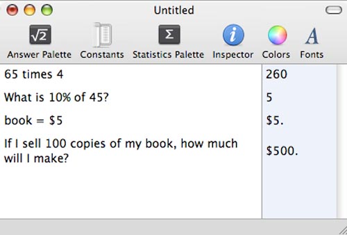
In response, some designers went back to the concept that made skeuomorphism so popular: how we use digital devices. They looked at the things that are absolutely necessary to apps, layouts and programs, and they stripped out every single design element that wasn’t strictly necessary. As such, they developed flat design. With flat design, designers were able to create things that embraced the new abilities of our powerful digital devices. For example, calculators in flat design can show more than one line of numbers at a time, can include text, and can have more buttons than skeuomorphic calculators.
Source
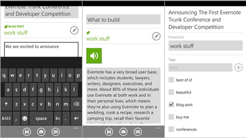
Perhaps appropriately, the current flat design revolution has been led by Microsoft. Microsoft released Metro with the Windows Phone and later with Windows 8 (although due to the copyright infringement of a German supermarket chain, it is now officially and awkwardly known as Microsoft design language). When it was released, the design was the first thing people noticed. There were no shadows, no wood effects and no pages to turn. Instead, there were blocks of colour and bold typography. The design took those who had long been fans of minimalism and pure functionality over design flourishes by storm.
In many ways, the gauntlet had been thrown down. There were the devotees of intuitive usability and naturalistic design elements in Apple’s design corner, and proponents of pure functionality and modern minimalism in Microsoft’s.
The two sides come together
As it turned out, the two camps were reluctant to be diametrically opposed into Team Apple and Team Microsoft. Most designers saw benefits and disadvantages in both approaches, and new technology was making the fight seem irrelevant.
High-definition displays, like Apple’s Retina Display, meant screens were coming significantly closer to paper in terms of visual quality. Designers were no longer limited to web-optimised fonts and flourishes to create stunning designs. Web designs could have the same visual impact as paper, with just some bold type and the judicious use of white space.
Responsive design, too, played its part in bringing the two sides together. Web design strategies moved from having one design for each device it might be viewed on to having one design that reformats itself to fit the device it is being viewed on. This meant that elements on a page were no longer a fixed size and layouts would shift, depending on how someone was accessing the site. Elements that couldn’t shift and respond, such as graphic elements generated in Photoshop, were worse than useless in responsive design, so designers began giving up stitched borders and shiny buttons in favour of elements that could easily resize themselves.
Although high-definition took away the visual appeal of skeuomorphism and responsive design meant its realistic effects were impractical, skeuomorphism was not quite defeated. Within skeuomorphic design, designers highlighted the design hierarchy by placing a little shadow in the search bar or adding a gradient to the ‘Buy Now’ button. Removing those meant users had no real direction, which is disastrous from a design point of view. More, the intuitive usability of certain apps and programs, like the ability to turn a page with the flick of a finger or the knowledge that a picture has been taken because of the aural cue of a shutter click, were lost when flat design was used too strictly.
Source
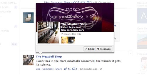
So designers began to reincorporate some of those elements into their flat designs. Cameras still clicked, pages still flicked, and calendars still stuck largely to single month or single week views. Flat design and skeuomorphism joined together, taking the benefits of each and leaving behind the avoidable disadvantages.
Source
Conclusion
The battle of skeuomorphism and flat design should be more a friendly rivalry than a war. When designers adhere too strictly to one side, they give themselves fewer and more restrictive design options. They could ignore potentially better design solutions because those solutions are from the wrong side. They create designs that shout a design philosophy instead of ones that aid the user in completing a task whilst looking beautiful.
Instead, designers should find a middle way between skeuomorphism and flat design, picking out the best bits of each for the particular project they are working on. In fact, this approach has been taken by Google of late. Google’s newest apps are not completely flat, but neither are they totally skeuomorphic. The map app, for example, uses flat colours with no shading on most of the design – completely in line with flat design principles. Still, the direction box at the top of the map and the route itself use slight gradients to make them pop out from the surrounding map – a classic technique of skeuomorphism.

A middle way is surely the best approach for most designs. As tensions cool on both sides of the skeuomorphism and flat design battle, this compromise is sure to become the prominent approach to design.


0 Comments