Thoughtfully designed mobile apps don’t just end with the design of the software itself. Great design should be found everywhere that the product comes into contact with, from the UI to the landing page that promotes it. One element that’s surprisingly important to get right is the Creative App Icons for the applications itself. When your app is downloaded, the icon is seen more often than the interface itself. It’s the first thing about your product that the user sees when they’re browsing the app store and they may see it throughout the day on the home screen of their phone. A well crafted app icon is important, and can change how users perceive your app – and whether it even gets downloaded at all.
We wanted to bring together some of our favourite examples of fresh, recent icons that are all extremely well designed. Some of these are for real iPhone apps, while others are concepts designed for fun and practice. Each one of these would happily deserve to belong on the home screen of a phone and has been designed with meticulous care and attention. Hopefully this collection will inspire you to focus on your own app’s icon or even to practice redesigning other examples. In either case, We hope you enjoy the roundup and if you think you know of any that haven’t been included, I’d love to hear about them in the comments section.
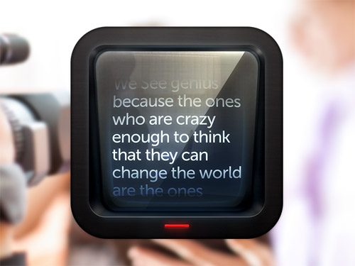
Teleprompter
Source: Link
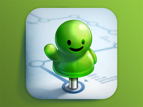
Evernote Hello
Source: Link
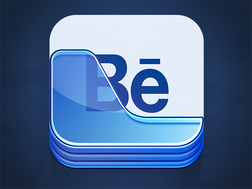
Behance Portfolio
Source: Link
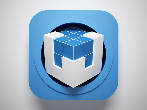
W
Source: Link
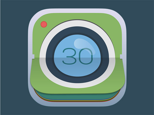
Photo Icon
Source: Link
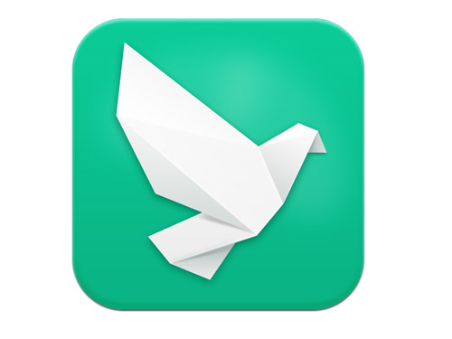
Direct Message for Weibo
Source: Link
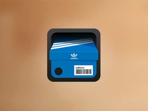
Adidas Shoebox
Source: Link
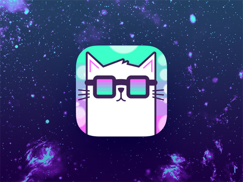
Cats in Space
Source: Link
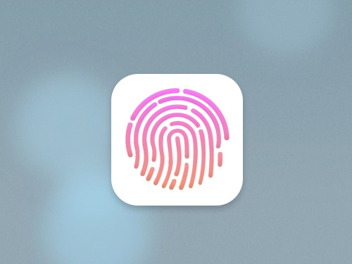
Touch ID
Source: Link
Merry Hostel

Source: Link
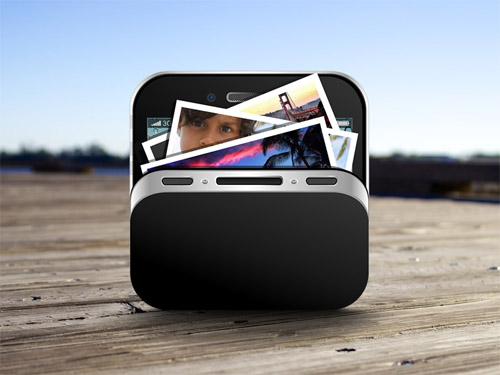
Photo App
Source: Link
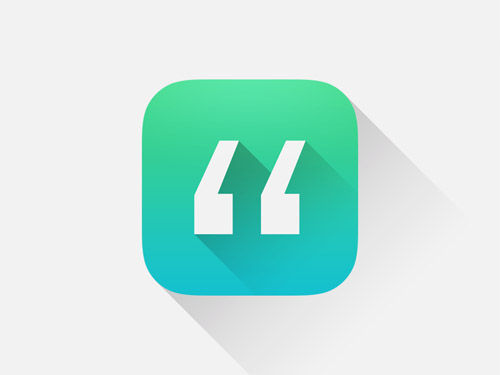
Quotes App
Source: Link
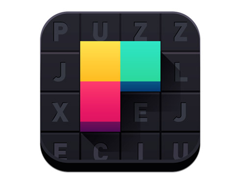
Puzzlejuice
Source: Link
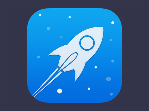
Rocket Icon
Source: Link
Mylake

Source: Link
Are there any icons that you’ve discovered that you think should be included in the list? We’d love to hear about them in the comments!





0 Comments